Getting Started: Running the
“Graphics Object Layer” demo
Required Hardware
Configuring the Hardware
Calibrating the Touch Screen
Demo Compatibility Matrix
The
demo projects are created to run on supported Microchip Demo Boards and
development hardware. Pre-generated hex files are available on the
"Precompiled Hex"
sub-directory found in the demo directory. These hex files are generated using
the alternative hardware profiles found in the sub-directory named "Configs".
Use the "Demo Compatibility Guide" when running pre-generated hex
files appropriate for your hardware.
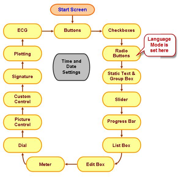
The
Graphics Object Layer (GOL) demo exhibits the basic functionalities of the GOL
Objects. It is composed of multiple screens showing how the different GOL
Objects can be utilized with a touch screen, demonstrates how to bind some
objects and use GOL Messages to pass parameters from one object to
another. The demo has two language modes: Chinese and English modes. When
selection is done, the strings used in the demo are mapped to the language
selected. Both modes use the same fonts to save memory space. The default font
file GOLFontDefault.c located in the Microchip/Graphics/ directory is NOT used
in this demo. Instead, the file named ChineseFonts.c is used. This font file
contains the GOLFontDefault
and another named GOLSmallFont. Both fonts are reduced fonts generated using
character filters defined in the application directory named
FontFilter. The font tables include only the standard ASCII set (32-127)
and the Chinese characters that are used in the demo. The summary of the
strings used for the two modes are placed in the ChineseFontsfontref.h file.
All
font tables used in the demo are generated using the "Graphics Resource
Converter" (grc.jar) utility. Please refer to the utility documentation
for details.
The
demo starts with the Microchip Start Screen and using the touch screen you can
navigate through all the screens showing the different GOL Objects that can be
used in the library.
Side Buttons Support
An
additional feature of the library is the support for keyboard. Four Explorer 16
buttons (S3, S4, S5 and S6) are used to control the demo. The key assignments
are enumerated below:
·
S3 - Enter Key
·
S4 - Down Key
·
S5 - Up Key
·
S6 - This moves
the focus on the screen.
You
can perform actions on the objects using these buttons. You can actually
navigate through all the demo screen using buttons S5 and S6. Where S6 toggles the
object selection and S5 performs the action on the object. S3 and S4 buttons in
this demo works only for the slider. Pressing the S3 or S4 buttons will
decrement or increment the slider thumb’s position.
Demo Limitations
Compiler
optimization level must be set to "1", "2", or
"s" for PIC24FJ128GA010, dsPIC33FJ128GP804 and PIC24HJ128GP504. For
evaluation copies of the compilers that have expired, a purchase of the valid
license will be needed to to set the optimization levels to "1",
"2" or "s".
For
PIC32 Starter Kits:
·
No potentiometer
present. The plotting demo with external source will not work.
·
No available
button to perform focus control.
·
Secondary
oscillator when not populated will not update the date and time demo that is
based on the RTCC module.
Demo Procedure
1)
Connect the
necessary hardware and program with the correct pre-generated hex.
2)
When running the
demo for the very first time, you’ll get touch screen calibration menu. Please
refer to Screen
Calibration for details.
3)
After you exit the calibration menu or
immediately after power up the Start Screen will be shown. Touch the screen to
continue.
4)
The screens showing GOL objects will appear.
Navigate through the demo using the Next (») and Back («) buttons on the sides.
5)
Notice the time
and date is displayed on the upper right corner of the screen. To set the date
and time press on the date and time group box. Note that only the touch screen
interface is enabled when setting time and date. To exit just press the exit
button. Time and date set will be reflected in the time and date group box.
6)
To jump from one
screen to another press on the Microchip logo on the upper left corner. A pull
down menu will appear on the screen. Releasing your press will remove the pull
down menu. To jump to a screen, drag your stylus or finger while pressing to
the desired screen title. Once the title is selected, release your finger or
stylus. The screen chosen will be displayed. To cancel selection, simply drag
your finger or stylus outside the drop down menu and release. You will return
to the current screen. The pull down menu has two lists. The first list has one
item named “MORE” at the bottom. Selecting this without releasing your press
will bring up the second list. The second list also has a “BACK” item that
gives you ability to return to the first list.
Microchip
Start Screen
This screen shows the start of the demo. Tap the
screen to proceed.
Before describing the other screens of the demo, the
navigation buttons are defined:
·
Back («) button –
This button, located on the left side, directs the user to the previous screen.
Before the previous screen is shown, all objects in the current screen is
destroyed and removed from memory. The previous screen is created from scratch
and displayed, replacing the current screen.
·
Next (») button
– This button, located on the right side, directs the user to the next screen.
Before the next screen is shown, all objects in the current screen is destroyed
and removed from memory. The next screen is created from scratch and displayed,
replacing the current screen.
Buttons
This screen is composed of a Window with 7 buttons
drawn on its client area. Going from top to down and left to right direction,
each button’s actions are described below:
1)
The 1st Button shows
the basic functionality of the object. Appearance of the object changes from
Pressed to Un-pressed when pressed or released.
2)
The 2nd Button
shows a gradient bitmap drawn over the button’s face.
3)
The 3rd Button
shows that multiple bitmaps can be displayed in the face of the button with
text. For every state a different bitmap can be rendered. Text shown is also
moved to the upper left corner of the button’s face.
4)
The 4th Button
is configured to toggle mode. Every press will toggle the button from press to
release or release to press.
5)
The 5th and 6th
Buttons (colored green and red respectively) is configured to complement each
other. When one is pressed, the other will be in the released state. This
emulates an exclusive or property just like in ON/OFF switches.
6)
The 7th Button
is disabled. All touch screen and button actions are ignored by this object.
Note that the object that you operate on is selected
as the current focused object. This can be verified by a dotted rectangle is
drawn on the face of the object. When this rectangle is drawn on or around the
object the state of this object is set to Focused and when removed the state is
Unfocused. Not all objects have this feature.
Checkboxes
This screen is composed of a Window with 3 check
boxes drawn on its client area and a rounded button (“HOME”). Each object
actions are described below:
1)
The 1st Check
Box changes the location of the text in the button to align left. Notice again
the dotted rectangle drawn around the checkbox when the object is selected and
removed when the object is not selected.
2)
The 2nd Check
Box changes the text alignment to bottom.
3)
The 3rd Check
Box is disabled. All touch screen and button actions are ignored by this
object.
4)
The Button is
implemented using multi-line strings and operates in default settings.
Radio
Buttons
This screen is composed of a Window with 2 groups of
radio buttons its client area. In a radio button group only one radio button
can be selected at a time. Group boxes (Group1 & Group2) defines the two
groups.
Group 1 actions are described below:
1)
The 1st Radio
Button (Rb1) has its state set to active and initially checked. This is also
the head object of the group. The filled circle drawn indicates that it is
checked.
2)
The 2nd Radio
Button (Rb2) set to active state.
3)
The 3rd Radio
Button (Rb3) set to active state.
4)
The 4th Radio
Button is disabled. This object cannot be selected and ignores all touch screen
and button actions.
Group 2 functions similarly to Group 1 but in this
group the language selection of the whole demo is controlled by the two radio buttons.
English is the default setting. To change to Chinese language, select the
Chinese radio button.
Static Text and Group Box
This screen is composed of a Window with a Group Box,
Static Text and one group of Radio Buttons drawn on its client area. The Static
Text is drawn inside the Group Box. Each object actions are described below:
1)
The Radio
Buttons are used to select the text alignment of the Group Box Title and the
Static Text.
·
L – Selects left
alignment.
·
C – Selects
center alignment.
·
R – Selects
right alignment
2)
The Group Box
title “Group Box” alignment is controlled by the radio buttons.
3)
The Static Text
is drawn with a frame. The text “Microchip Graphics Library Static Text and
Group Box Test.” alignment is also controlled by the radio buttons.
Slider
This screen is composed of a Window with a Group Box
and three sliders drawn on its client area. Each object actions are described
below:
1)
The Group Box is
drawn without a title. The small black square drawn inside the Group Box can be
moved by the touch screen. Touching any point within the Group Box moves the
black square in that position. At the same time the 2 active sliders are
updated reflecting the horizontal and vertical position of the black square on
the Group Box.
2)
The 1st Slider is
disabled. All touch screen and key actions on this object are ignored.
3)
The 2nd Slider
thumb position can be moved by touching the screen or pressing S3 and S4
buttons. This also controls the horizontal position of the black square in the
Group box.
4)
The 3rd Slider
thumb position can be moved by touching the screen or pressing S3 and S4
buttons. This also controls the vertical position of the black square in the
Group box.
Progress
Bar
This screen is composed of a Window with a Progress
Bar and a Button drawn on its client area. The Progress Bar incrementally
sweeps the progress from 0% to 100% and vice versa. The Progress Bar does not
process touch screen or button actions. The Button, configured in toggle mode,
can change the speed of the Progress Bar animation.
List
Box
This screen is composed of the following:
1)
Window –
Contains all the objects.
2)
List Box –
Contains 7 items. Only 5 items can be displayed at a time.
3)
Two Check Boxes
– These selects the modes.
·
Single – This
enables the single item selection when checked. When unchecked, multiple items
can be selected.
·
Center – controls
the alignment of the text in the List Box. When checked, alignment is centered,
otherwise left aligned.
4)
Two Group Boxes
– These are added to label the Check Boxes.
5)
Scroll Bar –
This enables scrolling the List Box.
6)
Two Buttons
(with Up and Down arrows) – These objects are added to function together with
the Scroll Bar. Aside from
the ability to drag the Scroll Bar, the
Buttons also allows up and down movement of the Scroll Bar.
Edit
Box
This screen is composed of a Window with an Edit Box
and 16 Buttons. This screen emulates the telephone functionality. The buttons
marked with number 0-9, “*” and “#” serves as inputs for a phone number. Every
time one of these buttons is pressed, the number or character is displayed in
the Edit Box. The Button with ? symbol is the back space key. Pressing this
deletes the last character displayed. The Button with the “Green” phone
receiver icon and “Red” phone icon serves as the “Call” and “End Call” keys.
Pressing the “Call” key will show the text “Calling…” in the Edit Box. Pressing
the “End Call” key will erase text in the Edit Box. The Button “Hld” is the
“Hold Call” key.
Meters
This screen is composed of a Window with Two Meters
(METER1 and METER2), two Digital Meters and two Buttons configured to toggle
mode. METER1 is drawn with an ARC drawn over the scales. METER2 is drawn
without the ARC.
METER1 animates by increasing the values of the
meters and decreasing the values of the meter. The first button (with
alternating “accel” and decelerating “dclrt” text alternately displayed when
pressed or released) controls this movement.
METER2 is manually animated by pressing the second
button. METER1 animation can be also altered by pressing and releasing the first
button.
Values of the Meters are also shown. The colors of
the values changes from GREEN, to YELLOW and to RED. These colors define the
The Digital Meters shows the digital equivalent of
the meter values.
Dial
This screen is composed of a Window with a Dial and a
Meter. Dial and Meter are configured to have a range of 0-700. The Meter shows
the current value of the Dial. Turning the Dial (using the touch screen) in a
clockwise direction will increment the value of the Dial. Turning it in a
counter clockwise direction will decrement the value.
Also the demo lights up the LED in the Explorer 16
board when the Dial is turned.
Picture
Control
This screen is composed of a Window with Picture, a
slider and two check boxes drawn on its client area. Each object actions are
described below:
1)
The Picture
object is drawn with a frame. The bitmap is displayed with scaling (x1 or x2)
controlled by one checkbox. Bitmap shown is also changed to emulate animation.
There are actually 8 frames used to emulate animation.
2)
The 1st Check
Box names “Scale” controls the scale of the Picture.
3)
The 2nd Check
Box named “Animate” controls the animation of the Picture.
4)
The slider
controls the speed of the animation. This object will only be enabled when the
“Animate” control is set. Notice that the slider toggles from active to
inactive state when “Animate” control is toggled. The speed changes from
slowest when slider thumb is in the right most position and fastest when the
thumb is in the left most position. Animation speed is controlled by inserting
delays between the frames.
Custom
Control
This screen is composed of a Window, three Radio Buttons
and a custom object created and displayed in its client area. The custom object
shows an animation of a UP and DOWN arrow bitmap and a green bar drawn on a
blue background. The green bar emulates a fluid level. The level can be
modified by touching the screen. The level can also be controlled by pressing
the Radio Buttons. “Heavy Load” sets the level to high, “Normal Load” sets the
level to medium and “Light Load” sets the level to low. Changing the level
using the touch screen automatically sets the Radio Button selection. The
custom object does not process button actions.
Signature
This screen is composed of a Window with a Panel
drawn on its client area. The Panel encloses an area that functions as a paper
that the user can write to. This is similar to point of sale devices where
signatures of customers can be recorded digitally and stored.
Plotting
This screen is composed of a Window with a Panel
drawn on its client area. The Panel encloses an area that graphs the value of
the Potentiometer (R6) in the Explorer 16 Board in real time. Turning the
potentiometer will displays the new value of R6 in the Panel.
ECG
This screen is composed of a Window with a Panel
drawn on its client area. The Panel encloses an area where samples of a signal
can be displayed. The demo emulates an ECG sampled data in Scan Mode. The data
is not coming from an external source but rather from a pre-stored data in
memory.
Trademarks:
The Microchip name and
logo, the Microchip logo, MPLAB, and PIC are registered trademarks of Microchip
Technology Incorporated in the
PICDEM and PICTail are
trademarks of Microchip Technology Incorporated in the
SD is a trademark of the
SD Association in the U.S.A and other countries
Microsoft, Windows,
Excel, and Windows Vista are either registered trademarks or trademarks of
Microsoft Corporation in the